5 Ways To Write More Accessible Copy

MAKING COPY ACCESSIBLE
Whether you’re working on a Digital PR campaign or writing SEO copy, accessibility should always be at the forefront of your mind.
Here’s why accessible copy is so important, and some top tips for writing it.
What is accessibility?
Accessibility describes how easy it is for people to access a particular product or service, regardless of any disabilities they may have. This also applies to any content you produce.
Put simply, accessible content is content that is equally effortless for everyone to read and understand.

Why is accessible copy so important?
Around 15% of the population live with some form of disability – which means a significant portion of your audience will, too.
That’s why it’s so important to make sure that all copy you write can be accessed by everyone, equally. This includes people with disabilities that might make this more of a challenge, such as a learning disability or visual impairment.
Fortunately, a lot of accessibility guidelines are also just generally good copywriting practices. Below are some of the key points to consider when writing accessible copy.
Tips for accessible copywriting
1. Use simple language
Good copy should be clear, concise and uncomplicated – all of which make it more accessible. Aim to keep things simple, and always consider your target audience.
Writing for a global audience? Steer clear of niche colloquialisms, and use simple vocabulary. Writing for a more specific audience, like hedge fund managers or bee-keepers? You’re okay to use more technical terminology but should still aim for simplicity overall.
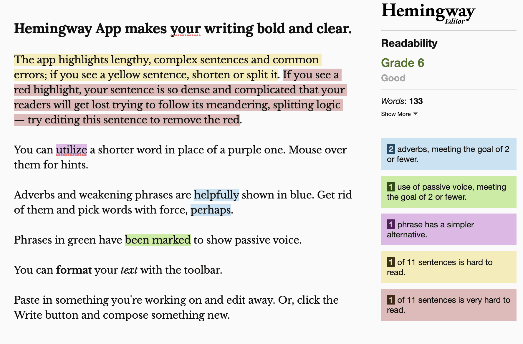
Though copywriting is generally a creative discipline, you need to strike a good balance between creativity and readability. A great way to check the readability of your content is to use a tool like Hemingway App, which awards writing a grade based on how easy to read it is.

2. Keep structure clear and consistent
Consistent use of clear headings and subheadings (i.e. H1, H2, H3, etc.) is great for SEO, and is also key for making content more accessible. Break your copy down into logical sections, and include plenty of bullet points and numbered lists to make it easy for readers to scan for information.
And remember, white space is your friend – which means avoiding huge blocks of text and keeping paragraphs as short as possible.
This clear structure makes content visually easier to digest and ensures it can be read by a screen reader, which many visually-impared people use to access content. You can test your copy for this by using a built-in screen reader, like MacOS Voiceover or ChromeVox.
3. Only use descriptive hyperlinks
The anchor text of a link always needs to explicitly describe where the link will take the reader. There’s no point in including a link that simply says ‘click here’ if the reader doesn’t understand where ‘here’ will actually take them.
Inaccessible hyperlink:
‘Read our article about the importance of accessible copywriting here’
This link is not accessible, as ‘here’ doesn’t give the reader any information about the link destination.
Accessible hyperlink:
‘Read our article about the importance of accessible copywriting’
This link is accessible, as it clearly describes the page we’re linking to.
Descriptive links ensure that readers using assistive technology such as a screen reader can properly understand and access them. (They’re also key for SEO, which is all the more reason not to forget them!)
4. Don’t rely on images or designs
Incorporating images and designs can be a fantastic way to boost your copy, but it’s important not to rely on them too heavily. They should add to your copy, but not be crucial to understanding it.
For example: including a design to showcase data from a survey is great, but if it’s the only way the data is displayed, this is not accessible. Designs and images should never include information that isn’t also included within the copy itself.
You also need to remember alt text, which describes the content of an image to readers who can’t see it. Purely decorative images don’t necessarily need alt text, but any images or designs that convey information – such as graphs – always need to be accompanied by clear alt text.
5. Make accessibility a priority
Making accessibility a priority throughout the whole writing process is key to ensuring all copy you create is accessible. Don’t just throw in a few extra subheadings at the last minute and think that’s enough, because it’s not!
You also shouldn’t be afraid to ask questions or raise concerns. For example, if a client has asked you to follow a specific format that you feel is not accessible, there’s no harm in raising this and suggesting an alternative, more accessible structure.
Extra tips to improve accessibility:
-
- Seek out perspectives from people with disabilities. Listen to what they say about accessibility and how to improve it.
- Test the accessibility of your copy by getting a wide variety of people to read it before it goes live.
- Keep up with Web Content Accessibility Guidelines (WCAG), which are internationally-recognised recommendations for improving web accessibility.
Remember that these guidelines apply to all web-based writing, whoever your audience is. You never know who may have specific access needs!
Are you looking to increase your brand exposure through excellently writteb digital PR campaigns? Get in touch with our experts today.

 Search
 PR
PR AI Visibility
 Social


